Streamlining Access to
Community Content and Timely News

Overview
Scope: A fictional website redesign of ABC7 that focuses on reimagining this content-heavy site's navigation.
Team: Four Designers
Role: UX Designer
(Owned: Competitive Analysis, Persona Development, Affinity Mapping, Sitemap Creation, User Flows, Wireframe Creation, UI for Mobile, Prototyping, Accessibility Testing)
Tools: Asana, Figma, Maze, Miro, Zoom
Timeline: Two-week design sprint
Methods Used
Organizational Research, User Research, Competitive Analysis, Heuristic Analysis, User Interviews, Affinity Mapping, Persona Development, Information Architecture, Sitemap Creation, Card Sort, User Journey, User Flows, Usability Testing, Design Studio, Design System Creation, Wireframe Creation, Prototyping, Accessibility Testing
Problem
Based on our research, Chicago locals can’t easily find COVID-19 (Coronavirus) information, weather, and current news both at home and on-the-go because they feel overwhelmed due to an abundance of content and exit the site early.
Solution
Through research, collaboration, and iteration, we developed a desktop and mobile breakpoint for ABC7 Chicago’s website that includes intuitive navigation, visible CTAs, and consistent & breathable content.
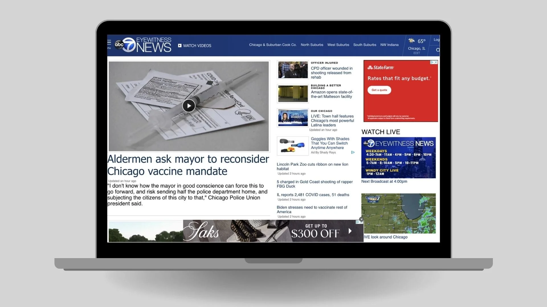
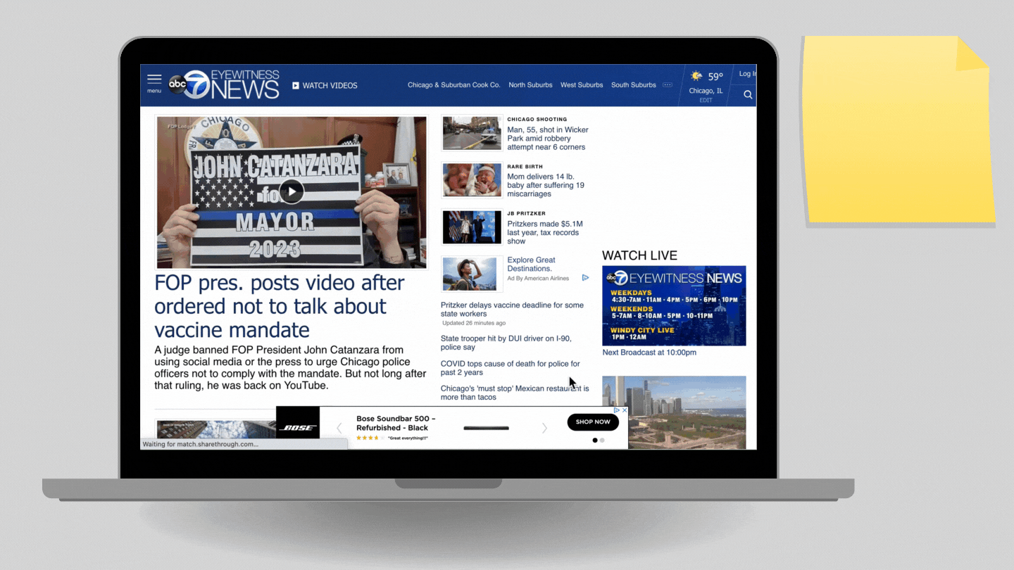
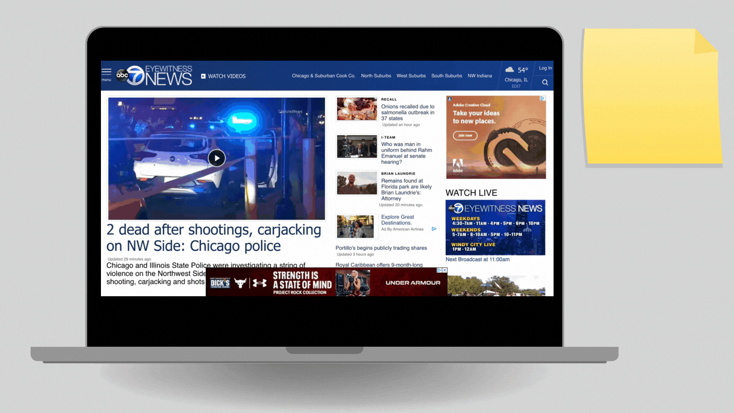
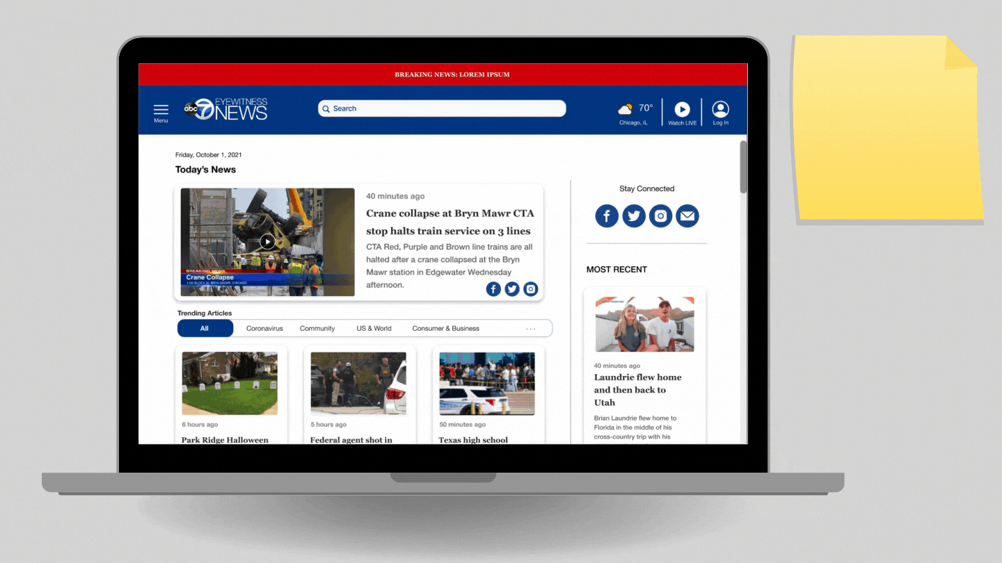
Original Site Homepage

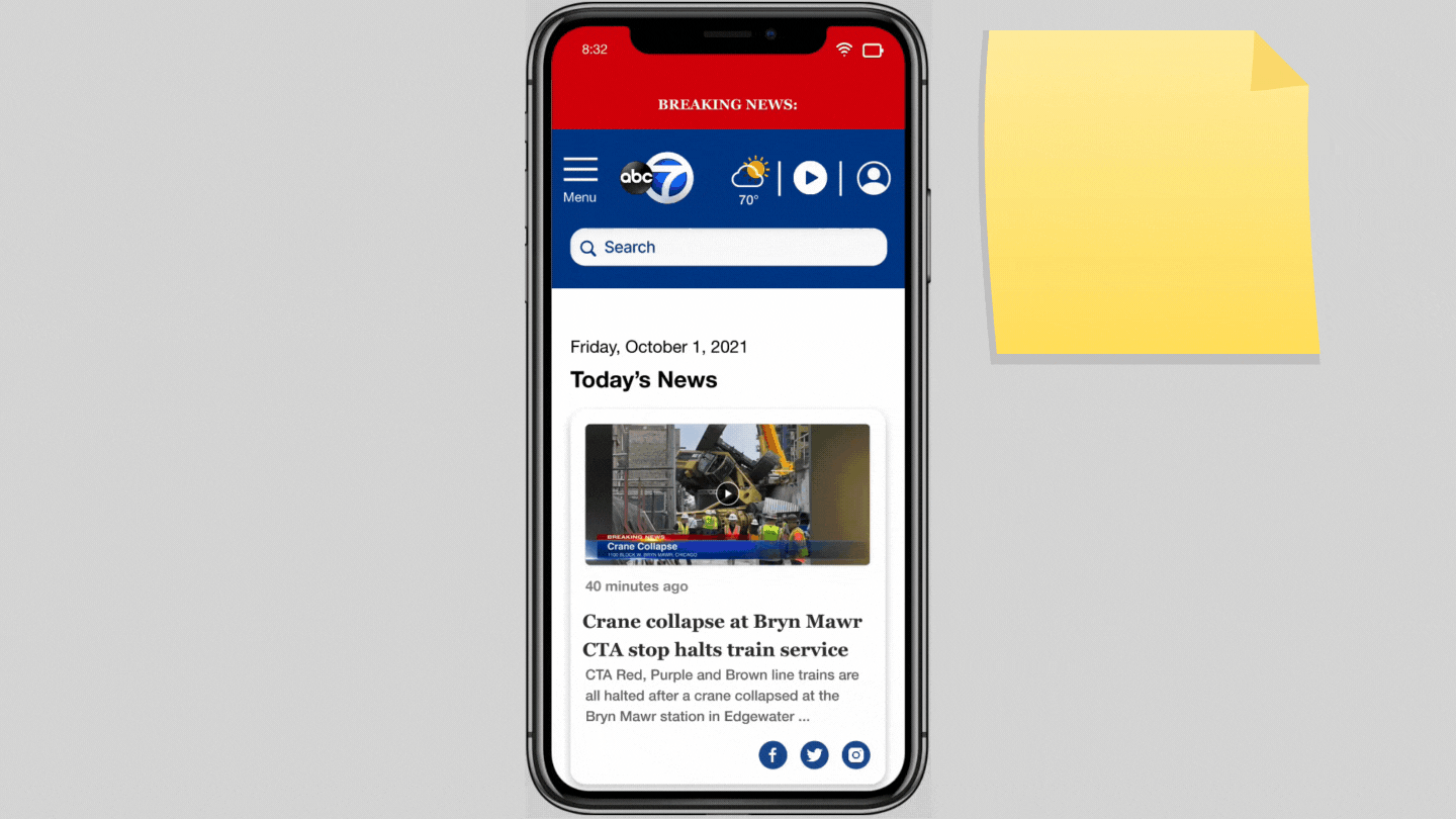
Proposed Solution Homepage
Starting with Research
We began with organizational research, defining ABC7’s business goals, mission, branding, and tone.
Next, to better understand industry conventions, my teammate performed a heuristic analysis while I conducted a competitive analysis and created a feature inventory, examining Chicago Tribune, NBC Chicago, and Fox32 Chicago.
Two Major Findings From Competitive Analysis:
1. Current news labels are in or under the header

2. Time stamps are consistently displayed next to article headlines
Determining Target Users
My teammate conducted demographic research and narrowed down ABC7’s target user group: people who want to stay informed and be conversationally literate in social situations.
While prepping for interviews, we leveraged this demographic research to pre-screen users, including age, income, and frequency of news consumption.
Insights from Users
Through conducting seven user interviews, we uncovered the WHY behind how they get their news, and some of their wants and expectations with news platforms. Then, I synthesized this data to create an affinity map and sort users’ most significant needs.

Testing The Original Site
To pinpoint areas of opportunity for improvement, we developed user flows of the original site. We asked ten target users to walk through a usability test with three separate tasks. One critical task in which we asked users to find a COVID-19 booster shot article pointed us toward a significant navigation issue.
Discoveries From Usability Test:
This data told us that users struggled to find the “Health and Coronavirus” category and complete the task quickly.

Validating and Invalidating Our Assumptions
This data led us to the question, “what did users specifically like and dislike about the current ABC7 site?” We followed-up with users to gather more qualitative data.
What’s Working:
Users felt it was appropriate to display the weather in the header constantly.
What’s NOT Working:
Overall, users struggled to navigate throughout the site, listing two key concerns:

Meet The Persona
After synthesizing our initial research, I pulled this data to craft a primary persona, focusing on honing users’ key needs and frustrations to center my team’s design process and decisions.

The Information Seeker:
Cameron Williamson
Chicago Native, 34yrs Old, Administrative Assistant
Needs:
Condensed content so she can be conversationally literate
Access to timely information so she can stay up-to-date
Frustrations:
Feels overwhelmed when there’s too much content in view
Digging to find more detailed information

Identifying the Problem
Once we had a solid understanding of our user and her pain points, we created a user journey and problem statement:
Users can’t easily find COVID-19 (Coronavirus) information, weather, and current news both at home and on the go because they feel overwhelmed and exit the site early due to excessive content.
Let’s Hypothesize
After narrowing in on the problem, we began brainstorming and asking each other questions about how we might help our user. We eventually crafted a hypothesis so that we had a baseline to test our assumptions:
We believe that by creating a desktop & mobile-friendly solution on an easy-to-navigate news platform for our users, they will feel more informed about timely topics and better connected to their community. We will measure success by tracking duration, cutting task competition time at least in half (<5.6 seconds).
Reimagining Site Navigation
Grounding ourselves in industry standards from our competitive analysis data, we dove into information architecture and organized a card sort to narrow down critical pain points in navigation.
Significant Findings From Card Sorting:
Users expected Breaking News & Trending Topics to be located at the top of the page in the main menu
Users created a broad Community category with all related topics grouped under this umbrella
These findings proved users’ confusion when attempting to navigate the original site.
I leveraged this data to create a proposed sitemap, where I reorganized and condensed categories to make the navigation less overwhelming and more intuitive for the user.
Condensed Original Sitemap: Community Content

Condensed Proposed Sitemap: Community Content

How Many Steps Does It Take?
After refining the new navigation layout for our proposed solution, we wanted to brainstorm more accessible paths users could take for critical tasks, like locating COVID-19 booster shot articles. We documented current user flows, as well as created proposed versions through multiple iterations.
Original Site Flow: Find a timely Coronavirus booster shot eligibility article
Proposed Solution Flow: Find a timely Coronavirus booster shot eligibility article
Let’s Talk Designs
We held a design studio to begin. My team drew out some ideas individually for the website redesign, collaborated on what worked and what didn’t, iterated, and came up with better-defined wireframes.
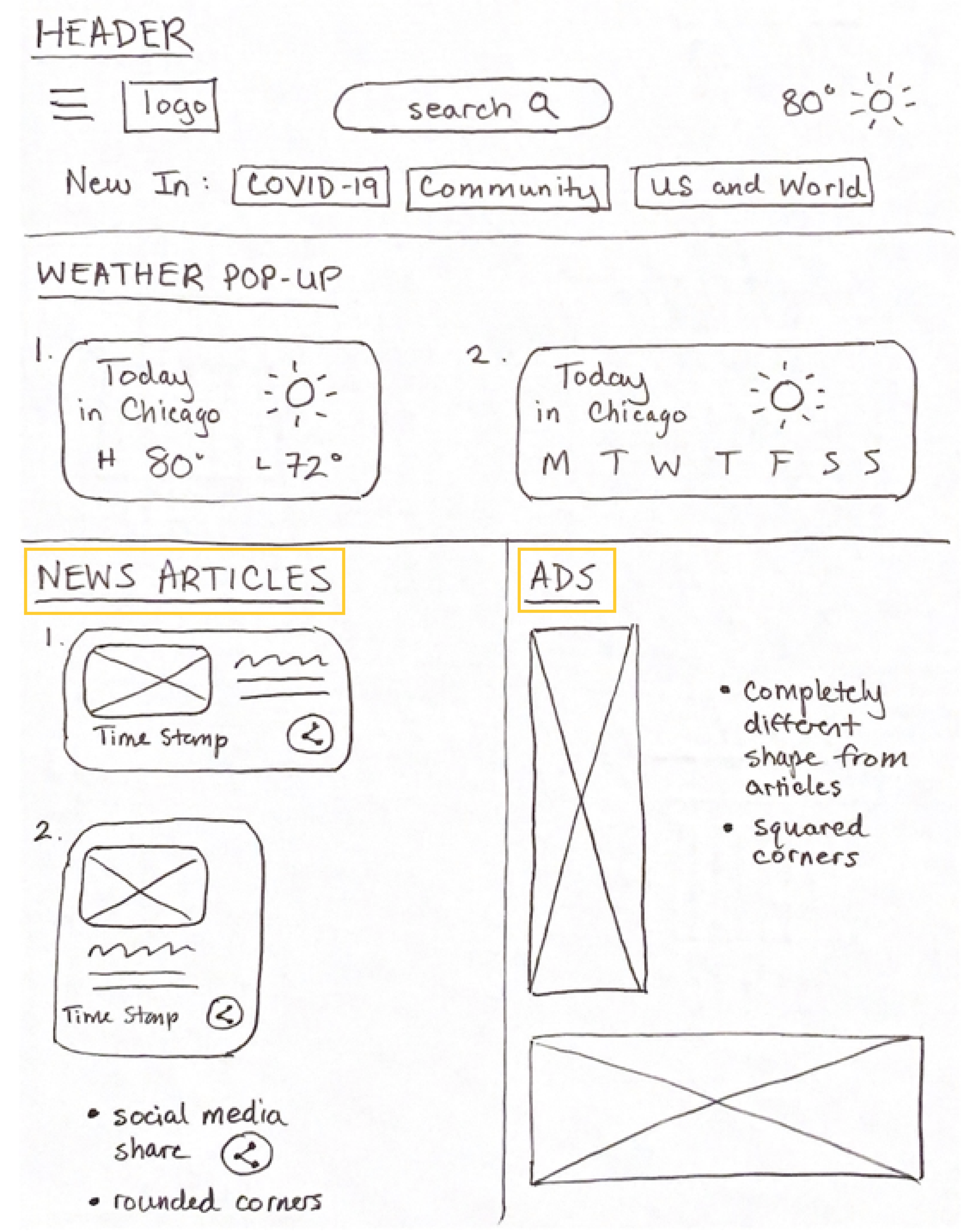
My sketch from our Design Studio.
Notable contributions to the proposed solution include:
News Articles: a social media share button on each article to encourage community engagement
Ads: rounded edges of article cards v.s. squared edges of ads to help users differentiate content

Low-fidelity Wireframe

Mid-fidelity Wireframes
All of the gathered information contributed to our proposed solution: a mobile-friendly website redesign that allows content to breathe and streamlines access to timely news through improved navigation.
Two Key Design Changes:
1. Originally, ABC7 had a category called “Health and Coronavirus,” We broke that down into two separate categories because users seek timely COVID-19 updates.

2. We also created a Community category in the hamburger menu and cleaned up the header by moving suburbs from the header into the Community category.

Testing The Proposed Solution:
Once we had low-fidelity wireframes, we decided to test our hypothesis using the same usability test tasks from the original site’s evaluation.
In terms of our hypothesis, our proposed solution was a success because through reimagined navigation, users could decrease task completion time under half the speed of the original site.
We saw improvement in the overall test results, with notable KPIs in the COVID-19 task (results summarized below).
Original Site Usability Task Results: Find a timely Coronavirus booster shot eligibility article

Proposed Solution Usability Task Results: Find a timely Coronavirus booster shot eligibility article

Compared to the original site’s test results, our proposed solution’s task duration decreased well over half the time, from 11.2 seconds to 4.3 seconds (<5.6 seconds). This KPI proved that when using our proposed solution, users were able to locate timely information more than twice as fast as they could on the original site.
Accessibility Check
Due to time constraints, I used a plugin to test our solution’s accessibility preliminarily. Elements in our prototype overwhelmingly scored WCAG AAA compliance, with two flagged issues regarding color contrast in the breaking news banner and article time stamps.
Within the design sprint’s timeline, I was able to deepen the tone of the red hue used in the breaking news banner to meet AAA compliance.

Initial Color (hex #C51F1F)

Updated Color (hex #A8130C)
The Proposed Solution
What’s Working:
We knew users needed a mobile-first platform for home and on-the-go news viewing, so we developed a design system in order to efficiently create a desktop web view and mobile breakpoint.

Lessons Learned:
Through performing usability testing on our solution, we learned that an important navigation element’s label was confusing users who thought they could find the same information via two routes, which contributed to a higher mis-click rate on our COVID-19 task for our proposed solution.
To increase clarity and further meet users’ expectations, we started to problem solve and analyze competitors again, changing the microcopy in our navigation bar from “New In“ to “Trending Articles.“ This lesson taught us that performing a competitive analysis focused on taxonomy and testing results with users in a content-heavy redesign project is essential for crafting an intuitive design.
Next Steps
Usability Testing
Time constraints limited our capacity to conduct usability tests. By leveraging another two weeks to continue iterating, we could further work out kinks in the design, so our solution could better adhere to users’ needs.
Accessibility
Additionally, I’d like to ensure our proposed solution meets WCAG AAA compliance across the board, so I’d like to leverage social networking support groups to connect with users and conduct additional accessibility testing. This approach would allow us to iterate on our article time stamp feature and comprehensively examine our proposed prototype, ensuring an optimal solution for people of all abilities.
Reflection
Due to the COVID-19 Pandemic, this was my first remote-based group project. This design sprint taught me that group collaboration can be very effective even if it looks different from in-person.

Me and my teammates
Overall, when it comes to sharing essential information with community members, creating a streamlined and easy-to-use news site that works for desktop and mobile was challenging yet rewarding. This content-heavy project focused on information architecture. Having to document and reorganize the site’s navigation showed me how critical it is to look at hierarchy and leverage users to reimagine a more intuitive structure.