Strengthening Community for Dog Enthusiasts

Overview
Scope: A redesign of a dog cafe’s website that centers on reimagining the events page to easily connect dog enthusiasts to the cafe’s community.
Team: Four Designers
Role: UX Researcher
Tools: Asana, Figma, Maze, Miro, Zoom
Timeline: Three-week design sprint
Methods Used
Organizational Research, User Research, Competitive Analysis, Heuristic Analysis, User Interviews, Affinity Mapping, Persona Development, Information Architecture, Sitemap Creation, Card Sort, User Journey, Empathy Mapping, User Flows, Usability Testing, Design Studio, Design System Creation, Wireframe Creation, Prototyping
Problem
Based on our research, Boris & Horton customers need a way to efficiently connect with the cafe’s community of dog enthusiasts through attending events, and lending support because it makes them happy.
Solution
Through research, collaboration, and iteration, we developed a mobile-first solution for Boris & Horton’s website that includes clear content, intuitive navigation, and visible CTAs.

Original Site Homepage

Proposed Solution Homepage
Research Breakdown
The majority of my research was dedicated to identifying business trends and goals, as well as connecting with the right users to get to the root of their needs.

Meeting The Stakeholder
Our client (the cafe’s co-founder) was interested in having the events and shopping pages on the Boris & Horton website revamped.
Our client shared that customers are always asking about what’s happening at the cafe that day or week and that there isn’t one single source of comprehensive information.
Evaluating The Site and The Market
After chatting with our client, my team conducted heuristic analysis of the original site and comparative analysis, examining local dog-friendly venues like cafes and breweries, as well as retailers and venues that regularly host events like bookstores and music halls.
Heuristic Analysis Findings:

Download complete heuristic analysis.
Competitive Analysis Findings:

Our Initial Assumptions
Keeping in mind our client’s business needs, and after evaluating the original website, my team and I landed on two main assumptions:
Boris & Horton needs to drive customers to their events page.
The website should focus on bridging the shopping experience from in-store to online.
User Research
During the project kick-off meeting with our client, we explained the UX process and asked if we the client could connect us with customers, so that we could learn their needs and pain points.
After a few days we found ourselves waiting to receive any contact information for those customers, so I decided to be proactive and do some demographic research, so that I could pre-screen users (based on age and income) and get the ball rolling in this short timeline.
Through demographic research I narrowed down Boris & Horton’s target user group: dog enthusiasts who shop for dog items online and visit dog-friendly venues.
Insights from Users
It took several days, but my team and I were able to connect with the cafe’s patrons.
Through conducting nine user interviews (five general dog enthusiasts and four loyal customers), we uncovered the WHY behind their appreciation of community built on dogs, contributing to their love of the cafe. Then, my team synthesized this data to create an affinity map and sort users’ most significant needs and pain points.

Discoveries
Through user interviews we discovered that users visit the site on mobile. And, users are feeling frustrated by the loyalty membership hole punch card system.
Validated Assumptions
Users shared that they visit the event page and Instagram to stay up-to-date on what’s happening at t6he cafe
Invalidated Assumptions
We learned that users aren’t using the shopping page because they buy in-store.
Testing The Original Site
To pinpoint areas of opportunity for improvement, we developed user flows of the original site. We asked ten target users to walk through a usability test with four separate tasks. Two critical tasks pointed us toward navigation issues.
Discoveries From Usability Test: Find A Specific Event Task:
This data told us that users struggled to navigate the Events page, where they thought the calendar itself was clickable due to a visible hover state, however, the calendar is not interactive.


Discoveries From Usability Test: Find Information About The Cafe Co-founders:
This data told us that users struggled to navigate the correct page. Users shared that the taxonomy was confusing, and that they were searching for an “About Us“ section. However, the original site was using the playful term “The Pack“ for this purpose.

Reevaluating Business and User Needs
We took this information back to the cafe’s co-founder. We wanted to dive deeper into long-term business goals to see how we could make the most impact for the cafe and its customers.

Meet The Persona
After synthesizing our initial research, I pulled this data to craft a primary persona, focusing on users’ key needs, frustrations, and goals to center my team’s design process and decisions.

The Loyal Customer:
Jess Fredricks
Lives in The East Village, NY, 35yrs Old, Dog Mom
Need:
Mobile friendly view since she’s always on the go
Frustration:
Inconsistencies and having to dig for the info. she needs
Goal:
Connect with other dog owners
“While the dogs are socializing, the people are socializing, so I've created some really good friends just from being at Boris and Horton on a weekly basis.”
Identifying the Problem
We wanted to better understand Jess, The Loyal Customer, better, so we created an empathy map.

Once we had a solid understanding of Jess and her pain points, we created a user journey and problem statement:
Jess needs a way to efficiently connect with her community of dog lovers through attending events, and lending her support because it makes her happy.
So, how might we help Jess easily access Boris & Horton community event information to increase meaningful engagement?
Let’s Hypothesize
After narrowing in on the problem, we began brainstorming and asking each other questions about how we might help our user, Jess. We eventually crafted a hypothesis so that we had a baseline to test our assumptions:
We believe that by creating a mobile-first solution of the Boris & Horton site for Jess, she will be able to quickly access desired information and therefore feel more connected to her community of dog enthusiasts.
We will measure success by tracking average mis-clicks and decreasing rates by 10% for each task.
Examining Site Navigation
Grounding ourselves in industry standards from our competitive analysis data, we dove into information architecture and organized a card sort to narrow down critical pain points in navigation.
Card Sort Findings:
Users created an About Us section to house content like co-founder bios and cafe information
Users sorted information into fewer larger categories for the main navigation (eleven navigation tabs on original site)
These findings proved users’ confusion when attempting to navigate the original site.
Let’s Sketch
We held a design studio to begin. My team drew out some ideas individually for the website redesign, collaborated on what worked and what didn’t, iterated, and came up with better-defined wireframes.
Then we created a design system to build our solution.


My sketches from our Design Studio.
Notable contributions to the proposed solution include:
To streamline access to information, an interactive events calendar with carrots to toggle between months
To allow for further community engagement, a share button for each event
To replace loyalty punch cards, a personalized QR Code membership pop-up after sign in


All of the gathered information contributed to our proposed solution: a mobile-first website that allows for quick and easy access to information and allows for further community engagement.
Testing The Proposed Solution
We decided to test our solution against our hypothesis using the same usability test tasks from the original site’s evaluation.
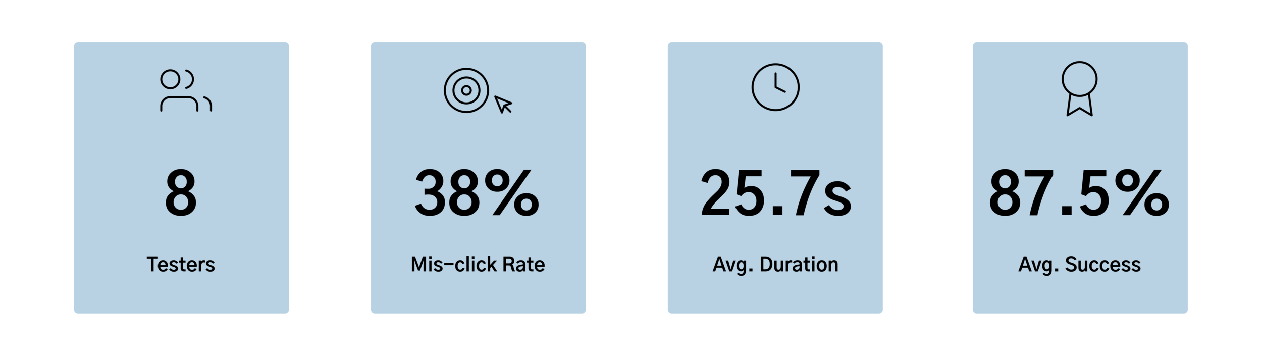
In terms of our hypothesis, our proposed solution was a success because users were able to complete tasks with significantly less mis-clicks (>10% decrease).
We saw improvement in the overall test results, with notable KPIs in two tasks (results summarized below).
Original Site Usability Task Results: Find a specific event (users were given event name, day and time)

Proposed Solution Usability Task Results: Find a specific event (users were given event name, day and time)

Original Site Usability Task Results: Find information about the cafe’s co-founders

Proposed Solution’s Usability Task Results: Find information about the cafe’s co-founders


Compared to the original site’s test results, our proposed solution’s task mis-click rate dropped (>10%). This KPI proved that when using our proposed solution, users were able to more easily and intuitively locate desired information than on the original site.
Bonus Feature
QR Code Loyalty Membership
After speaking with users we learned that the old school punch card membership was a pain because they would forget to bring their card with them or lose it. We also learned that the Honesty Policy is a huge value at Boris and Horton, so often workers would be kind enough to give out coffee redemptions even if customers couldn’t present their punch card.
We knew that not only was the physical punch card a pain for customers, but also that the cafe was losing out on revenue. So, we developed a digital punch card for both parties to easily access.
Unique and scannable QR code for every loyal member
Track number of redemptions
Visible membership renewal date

Bridging the Physical Cafe Experience with the Digital
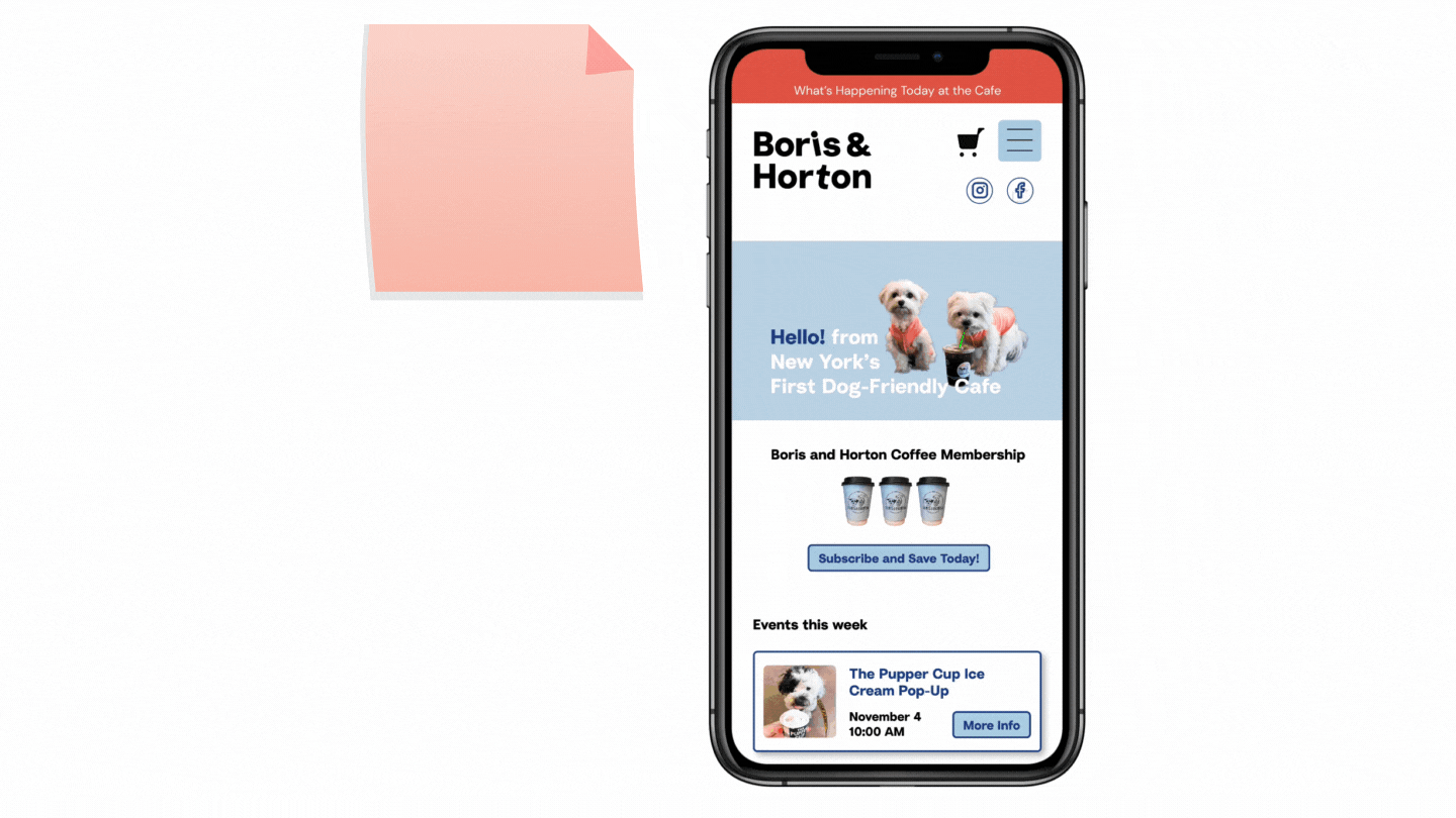
To help improve communication with customers, and give them easy access to stay up-to-date on what’s happening at the cafe, I knew we needed to leverage the physical cafe experience.
I developed a flyer, with a QR code linking to the events page. This way, our client can place these flyers around the cafe to encourage customers to explore the updated website and events page.

Next Steps
Usability Testing
Time constraints limited our capacity to conduct usability tests. By leveraging another two weeks to continue iterating to work out kinks in the design, so our solution could better adhere to users’ needs.
Implementation
With additional time, we could implement these changes into our client’s Content Management System (CMS) and see our designs come to life.
Reflection
During this project, I learned that I need to have a backup research plan in place when working under a tight deadline. Due to the fact that connecting with the cafe’s patrons was delayed, our process was delayed. I ended up doing demographic research to nail down the cafe’s target audience so we could interview general dog enthusiasts, but we still lost time.

Me and my teammates with our dogs
I also learned that what the client asks for might not be what the user needs. After our project kick-off meeting, we made the assumption that we would need to redesign the cafe’s shop page, however, through user interviews, we learned that customers aren’t shopping online, and brought up other pain points that we hadn’t considered.
Overall, this was a really fun project. Chatting with our client and her loyal customers made it clear how special this cafe is; there’s an incredible senes of community. It was amazing to be able to help bring the delight of the in-person cafe experience to the website through our design process.